
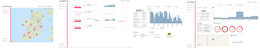
Heatmap visualization in Map Search
Temetra has shown meter and reading locations on a map using pins for a few years, but needed various work-arounds to accommodate clusters of meters at very large scale. Using a combination of techniques and search tools, we now show instant search results geographically even for millions of meters, with the areas of greatest density coloured to show where the hot-spots are.
Searching with results shown on heat-maps, you can often see geographic patterns in your data that are impossible to see with simple lists, or don’t stand out enough with simple numeric clustering.
This is particularly interesting when used in combination with our Analytics Module, to interrogate the rich data available inside Temetra.
- Where are all the DN15 meters using more than 30m³ per day?
- Where are all the wireless meters in this part of the city?
- Where have new or replacement meters been installed in the last month?
- Where is the greatest density of leaks reported by AMR meters in the last 6 months?
This short video from a demonstration network should give you an idea of how quick and interactive the feature is, even when dealing with very high-volume data. This area of the map has more than 1.5 million endpoints, and we’re getting search results on the map as quickly as we can zoom and scroll around.
Display of visual density is not always the best choice, so tools on the map let you switch between heatmap, clusters with numbers, or both, and as you zoom in to particular area, you still get our traditional clustering down to individual endpoints.
Portal Upgrade
Our customer portal has had a major re-design, with many asked-for improvements. The older portal suffered from the requirement to support very old browsers, but now that most users are using modern browsers we took the opportunity to improve the way we display the meter data, and provide more interactive visualization. For example, you can now use the mouse-wheel to zoom in and out very quickly, with more tooltip information on the bars and the ability to quickly switch from histogram consumption to line graph flow rates depending on context.
One of the concerns of the new design was the ability to add new features while maintaining simplicity for first-time users. We now have a solid base on which to introduce new features in the coming months.
Sparklines for Search Results
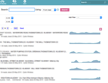
Sparklines in search results
As part of the portal upgrade, we’ve used many of the same techniques around Temetra itself, showing tiny graphs, sometimes called sparklines, to give you at-a-glance view of the flow pattern of your meters.
This is particularly helpful on search results where the addition of the flow pattern can help narrow down your selection.
Know there’s somebody with a recent leak or newly vacant property? Use the sparkline to help identify the meter within your results.
Because we have meters with widely varying amounts of data, from 15-minute interval data to daily or monthly fixed-date readings, we automatically select the most appropriate period and resolution. As you add more