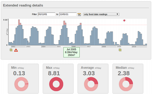
We’ve made further improvements to the visualization of meter data in Temetra. 
This gives you more information on the summary view of the meter and gives us scope to add more details from the latest generation of AMR transponders. As these devices get more and more sophisticated, they get closer to full data logging, and Temetra needs a way to accommodate all the new features.
We believe one of Temetra strengths is the ability to show you information about your meters in a quick and easy to understand way. These new transponders contain very detailed logging of the meter data, including min and max flows with timestamps, time of use, and detailed consumption information over a much greater period than previously possible. As we introduce support for these new transponders we need a way to give you an overview of the important data, without swamping you with the details, while keeping these details just a click away should you need them.

We now incorporate many different items into a single infographic, with the new timeline display showing you incidents and events that have happened on the meter, in context with the flow & consumption data.
Got a reason for increased flow, or why a tamper occurred? Add a dated note to the meter that’s a permanent record for others when they see problem, without the need to specifically open the notes.
We continue to aggregate the data from several wireless readings into a single continuous view, showing you data from the full meter lifespan, now with colour coding to show expected flow rates visually. We have transponders installed in Kerry & Dungarvan in 2001 that show full monthly details all the way to the present day.
